Dove Men+Care Japan

Dove Men+Care Japan
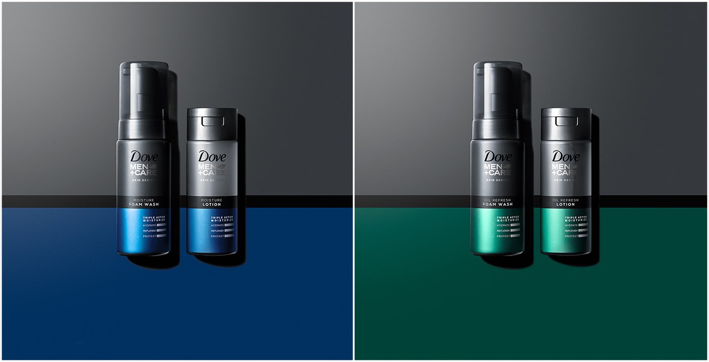
In a cluttered and saturated face care category, Dove Men + Care needed to stand apart from the competition while clearly communicating its benefits to consumers. forceMAJEURE designed the face care range with a sleek, premium look and strong branding along with a bold, masculine color palette to differentiate the variants and to stand out on shelf in advanced Asian markets.
We designed a small range of products that targeted men’s top face care needs. While remaining true to Dove’s heritage of being approachable and caring, we used bold, masculine colors and finishes to create a premium look and feel for the Dove Men+Care brand. We held onto the custom and iconic gray background color, while creating a strong color contrast with bolder, vivid metallic colors to differentiate the variants and stand out from competition. To further the premium perception, we evolved the Dove Men+Care logo by muting the Dove word mark in black as a support to the silver foil Men+Care word mark and bird icon. The telegraphic ‘Triple Action Moisture’ icon, brings the benefits to life--referencing the science and technology behind the products, while informing consumers of the new superior formulas of the range.
Since launch, the brand ranked number one best-selling foaming face wash on Amazon Japan.

